Ask Ollie
An AI travel companion to accompany your trip and help plan along the way.
Background
My role
Product designer, responsible for discovery, research, and branding redesign of the AI tool.
Timeline
5 Months (April 2025 -August 2025)
Tools
Figma, Illustrator, Photoshop, Userinterviews.com, unmoderated testing.
Tripadvisor’s mobile app represents our most engaged community of travellers, making it a critical channel for business growth and product innovation. As AI tools like ChatGPT began reshaping how people plan and experience travel, we saw an opportunity to reimagine our app as more than a booking or browsing tool — but as a true travel companion.
Our vision was to introduce Ask Ollie, an AI-powered assistant designed to guide users through every stage of their journey — from initial inspiration to real-time support on the go. By bringing Ollie directly into the app, we aimed to make trip planning more personal, efficient, and community-driven, all while strengthening app engagement and loyalty.
Problem
As AI reshapes how people plan travel, many users are turning to tools like ChatGPT, Claude, and Gemini instead of our app. We set out to explore how AI could enhance our experience—reducing the stress of trip planning and offering smarter, on-the-go support.
How might we help users plan and travel more confidently with the use of AI?
Current landscape
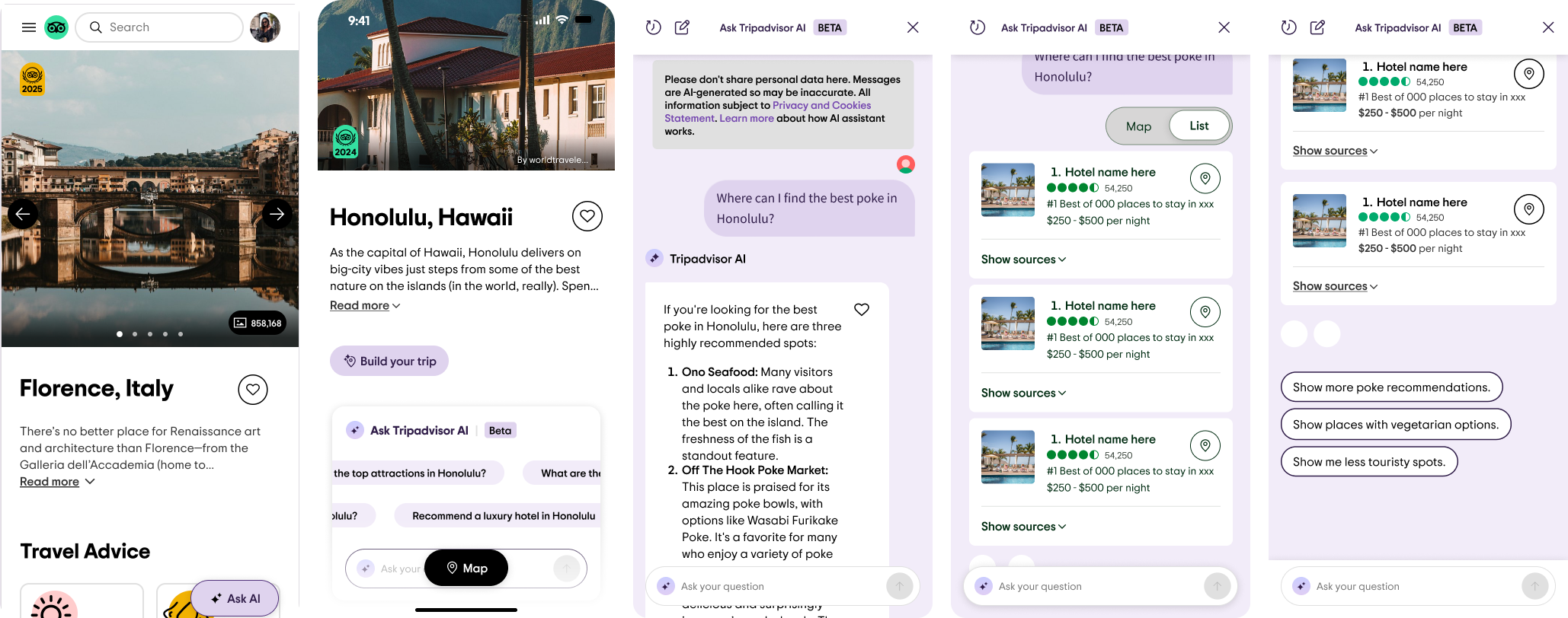
When originally built, limited attention was given to how this experience would translate to mobile. Early efforts focused on optimizing for web, leaving room to reimagine a truly mobile-first experience. The current AI Travel Assistant design centers on a standard chat interface within a purple brand scheme.


Key needs
Access to personalized guidance from anywhere, especially while on the go.
Receive personalized recommendations for hotels, attractions & restaurants.
Easily save & book recommendations & guidance.
Make confident, inclusive, community-backed travel decisions.
Maximize their time while in-destination (including transportation & logistics).
Offer support for non-travel-related questions.
Create a brand that is recognizable and feels in line with the Tripadvisor brand.

The rebrandWe took a pause to audit different AI experiences, and the one thing that became abundantly clear is how impersonal and distant most assistants are.
The question isn’t if you have AI. It’s why it matters.
How might we evolve our AITA to feel rooted in our brand and differentiated through its connection to our community? The answer became extremely clear, our community and travelers. Tapping into what makes Tripadvisor unique.
Powered by travelers, guided by AI.

From top spots to hidden gems, Ollie helps you plan with tips from real travelers. Take Ollie with you on your next adventure.
Here comes Ollie, your brand new travel companion. Bringing back the classic Tripadvisor bubbles to help you easily navigate and enhance your travel experiences with the help of over 1 billion reviews, forums, and traveler tips.
Final Designs
Final Designs

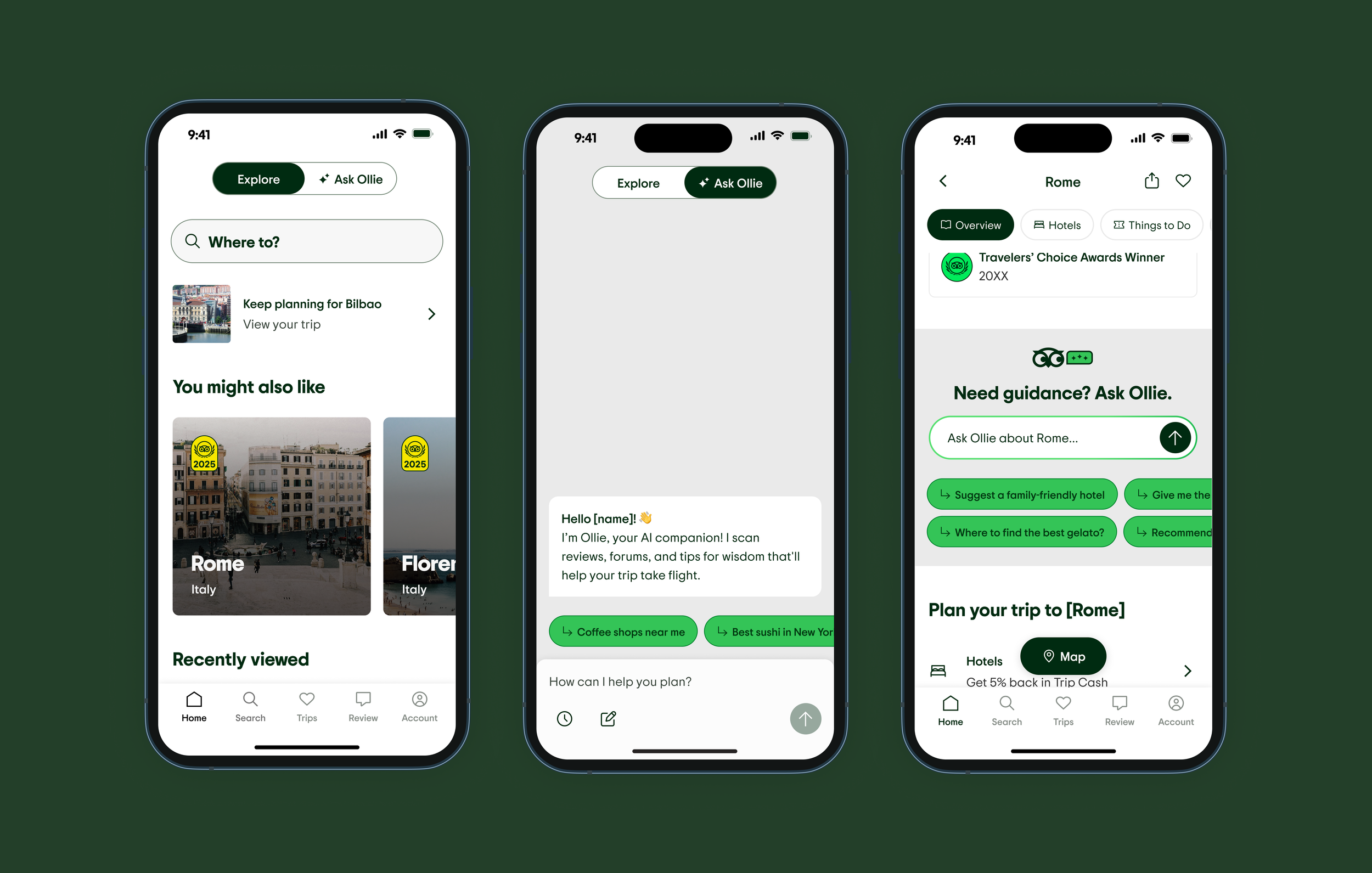
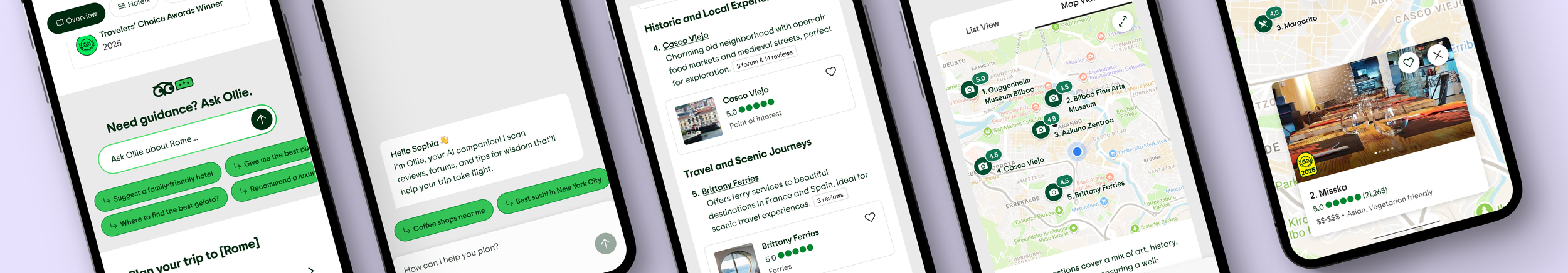
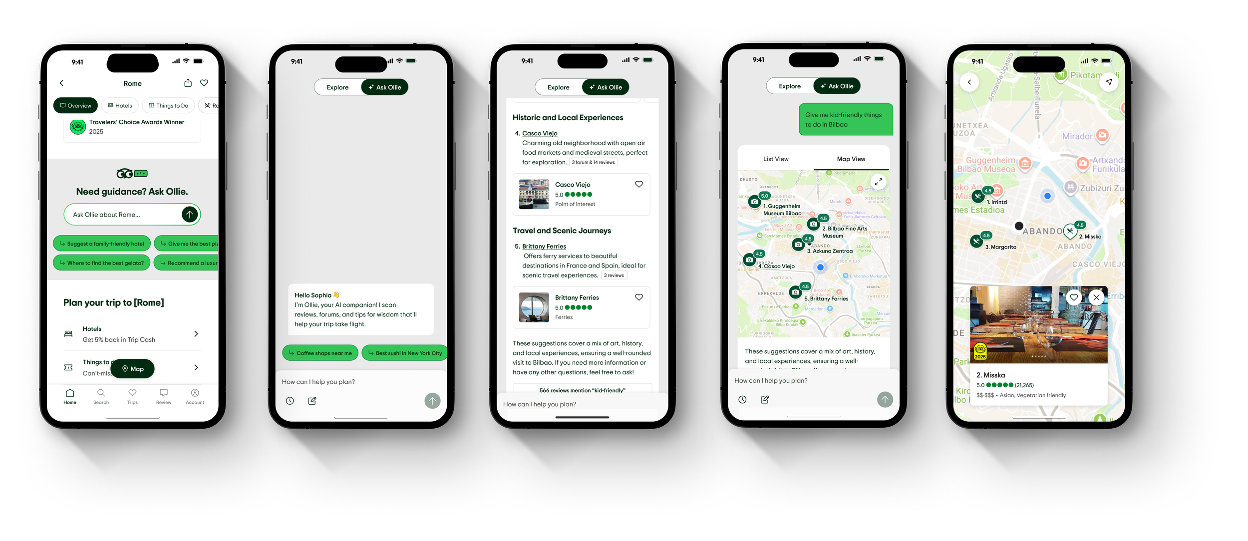
Entry points
A toggle on the home screen gives the AI Travel Assistant a consistent, easy-to-find location—encouraging discovery without disrupting core flows. Contextual in-line entry points surface relevant information and coach users toward high-value prompts.
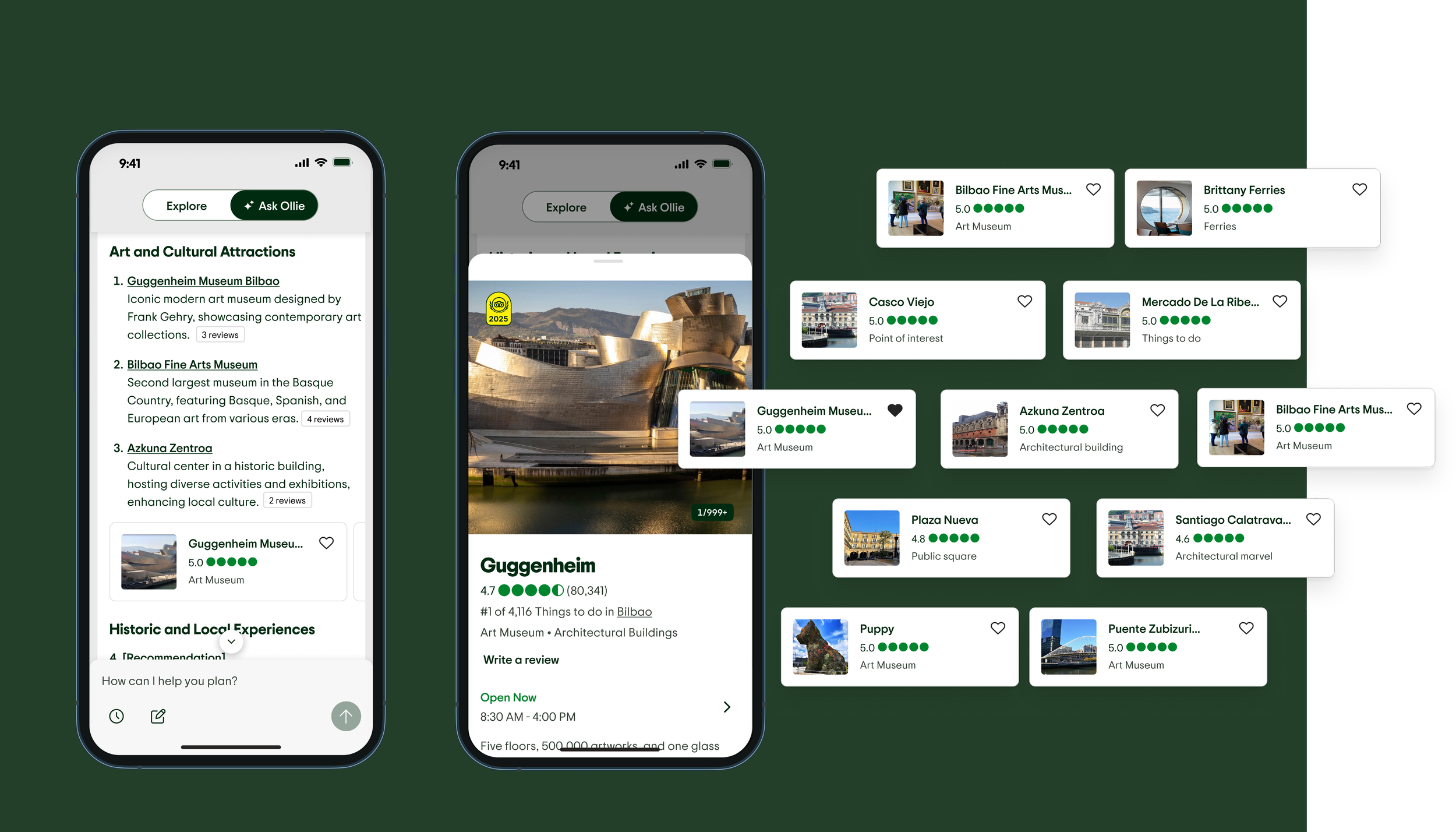
List and card view
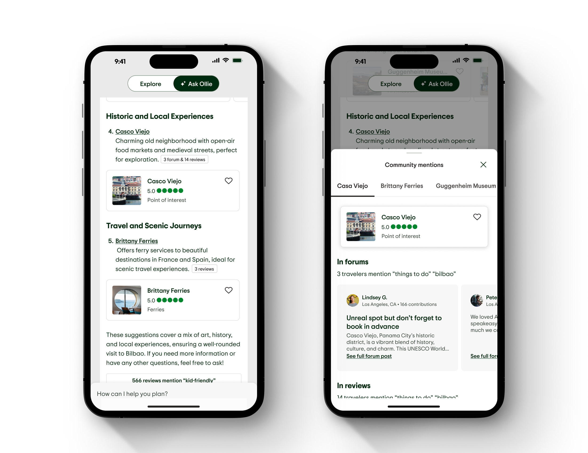
Rather than creating a maze of text recommendations and coordinating cards at the end of the summary, we’re bringing the two together. Text recommendations sit within the same section as their cards giving users the context around the recommendation and enabling them to act on it

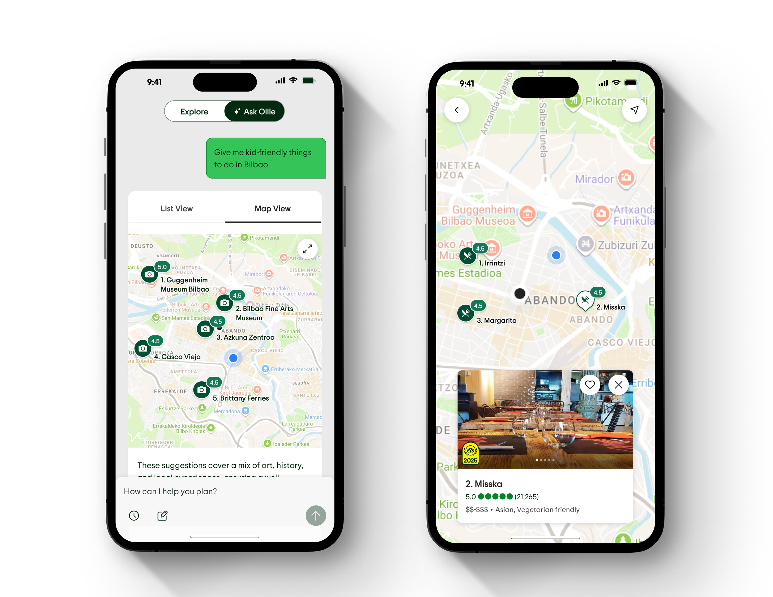
Map view
Given mobile’s limited screen space, hierarchy is key. Placing the map behind a secondary control allows AI summaries to take visual priority within the chat.


Prompting
Contextual prompts appear after each AI response, helping users discover new capabilities and inspiring deeper conversation.
Sources
Instead of separating text recommendations from cards, we’ve unified them. Text now sits alongside visual cards, giving users immediate context and a clear path to act.