NYT Podcasts
As an avid New York Times podcast listener, my platform of choice varies between Spotify and Apple Podcasts. This is all due, in part, because the navigation of the NYT podcast page is quite tedious. When you come across the initial podcast homepage, it feels more editorial for a user to read versus inviting them in to listen. This is what I set after to change.
BACKGROUND
With the acquisition of Serial production company and steadfast creation of their own series, The New York Times has effectively increased its audio content by almost 25% in 2020. Reaching 36 million in revenue. With that, the way The Times houses all of this content is becoming increasingly disorganized. I set out to optimize the app for the best user experience when it comes to browsing, discovering, and listening to new content.
ROLE
Lead and solo designer— discovery, user research, design, testing, iteration.
TIMELINE
July 2021 — 2 Week sprint.
TOOLS
Figma, Illustrator, Photoshop, Google hangouts
Challenge.
Re-designing the podcast landing page in a way that allows users to navigate with ease — eliminating pain points around finding and listening to new podcasts.
Solution.
01. Design a seamless podcast landing page to encourage users to discover in-app.
02. Optimize for auditory listening experience throughout the app - allowing users to listen and browse simultaneously.
Our Users.
The digital subscribers of The New York Times that prefer a different podcasting platform.
The goal — better user interface, better engagement.
CURRENT LANDSCAPE
This is the current landing page for podcasts on The New York Times app. The largest pain point with this setup is how it matches any other page hosting articles. Without any affordances to indicate an audio player, it’s difficult to distinguish whether it’s meant to be read or heard.
Diving into the research
Market Research
I spent a bit of time looking into the general podcast landscape and how it has evolved over time.
In 2020, 20% of people listened to podcasts on a weekly basis.
3/4 of people listen to podcasts to learn new things.
Average listening consumes 7 podcasts per week.
32% of people find new podcasts through word of mouth and by researching online.
Subscribers for The New York Times have grown to almost 8 million — with roughly 7 million being digital subscribers and the rest paper.
The Daily is one of the most popular podcasts with over 2 million daily listeners.
40% of listeners are 30 years old or younger.
90% have a bachelor’s degree or higher.
Between users browsing the app and those who are actively listening to podcasts daily, there is a huge opportunity to optimize the landing page.
The New York Times and Podcasting
Competitive Analysis
Spotify Podcasts | Apple Podcast | Google podcast | Stitcher | Audible | NPR
The competitive analysis shed light on a few main indirect competitors like Spotify and Apple — streaming sites that still house all the NYT podcasts.
Direct competitors came in the form of other editorial websites that have created popular podcasts like NPR, The Economist, and Vox.
Key findings
01. Users are looking to explore options when they look for podcasts.
02. Because The New York Times app is an editorial platform, users want to listen to a podcast while browsing.
03. Understanding the difference between a podcast and an article on the app.
04. Users really trust The New York Times platforms, often time preferring to go directly to their website.
05. The NYT app is already integrated into most users’ daily routines.
Mid-Fi Mockups.
01. The landing page came together fairly quickly. Here, I assessed what content The NYT currently houses on their homepage and designed much of the content in an easily digestible fashion that solves for both browsing and discovery needs — answering questions like:
What are the top shows/episodes of the week?
Where can I find all shows done by The NYT?
Breaking sections up with different collections and tiles to keep the user engaged and informed. Using grouping techniques to prioritize some content over others.
The floating play button came to fruition out of an interview where a user expressed frustration in the number of steps it takes to just play an episode. This solution allows for an easier flow from seeing an episode to playing it.
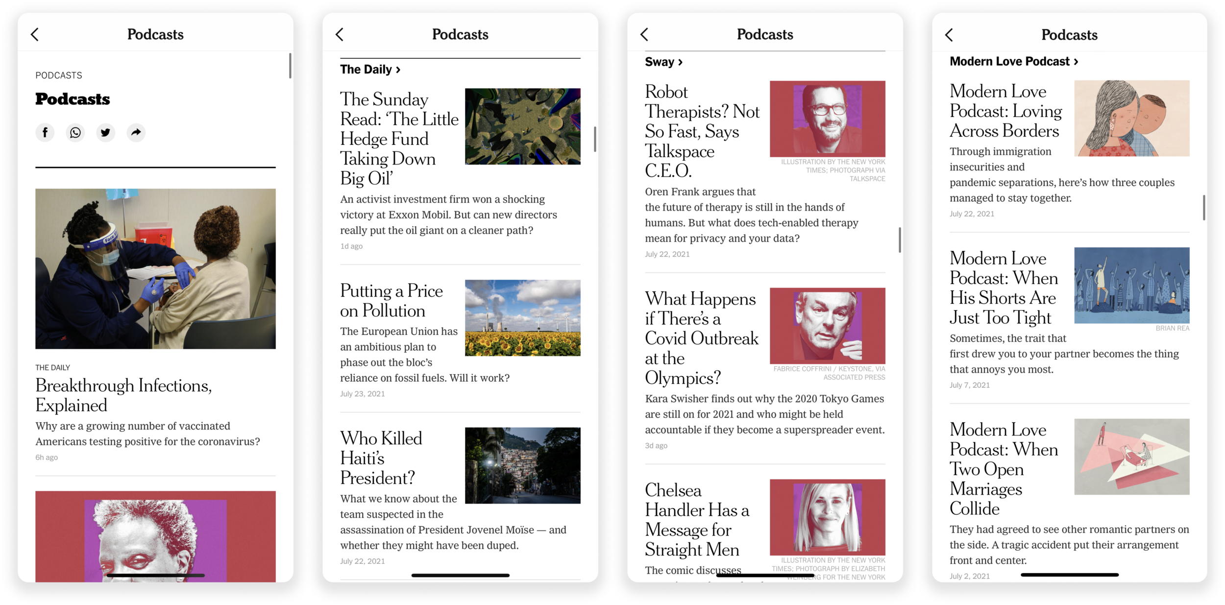
02. Individual podcast pages house all previous episodes in one place with the option to click in and reveal information about the individual episode theme.
Adding play buttons to each episode makes it easier for the user to quickly assess their options and make a decision on what they want to listen to.
In my interviews, a few users expressed how important it was to share episodes — I added the ability to share and bookmark your favorite shows. Ideally, the flow following the bookmark would end up where the rest of your NYT bookmarks go, but there is much exploration that can go into the bookmark moving forward.
03. Podcast collection page.
One of the largest pain points I heard from loyal NYT podcast listeners was that there’s no place to view all of the available podcasts at once. Simple enough of a solution — creating a collections page.
From my initial user interviews, browsing quickly and efficiently was a large pain point with the current podcast page setup. Within this collection page, I added a side scroll bar that alphabetizes the collections page for quick browsing.
Contextual placement
As I was browsing the app, I began to realize the lack of affordances around audio.
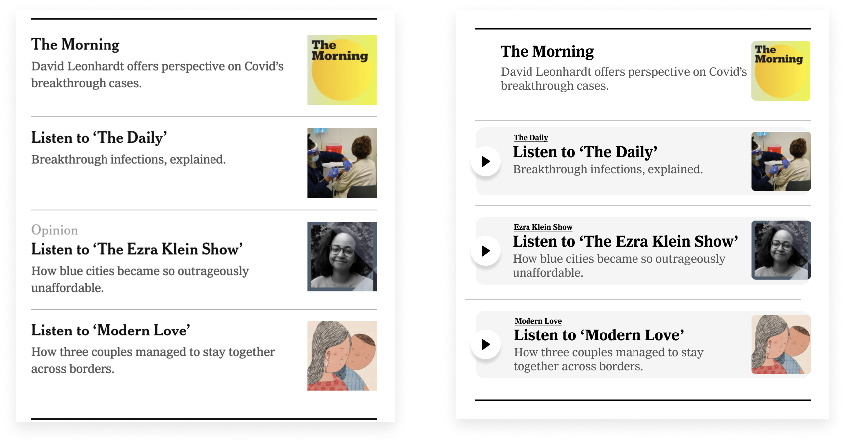
The image on the left is a screenshot of The NYT homepage, calling out the newest podcast episodes to listen to.
What begins to feel misleading is that if a user doesn’t read the headlines, they don’t realize it isn’t an article but a podcast!
I went ahead and changed that, adding play buttons to instances where podcasts are mentioned.
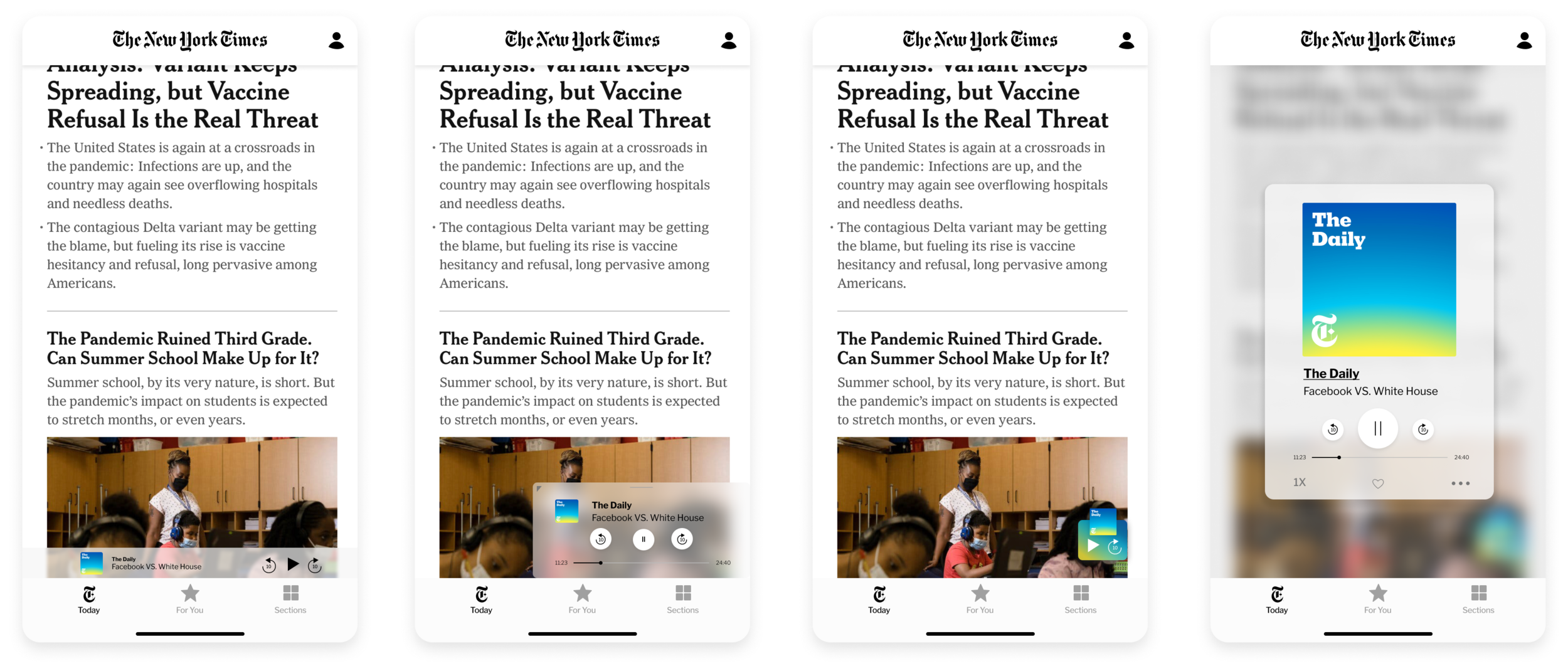
Where to house an audio player while allowing users to browse?
The largest hurdle to tackle here was designed for a browsing user. This is someone who is both looking at other content but wants to have the option provided for control over their audio content.
What player controls are absolutely necessary for a user when they’re browsing to allow them to feel in control?
With a few assumptions, I decided to pop this question back to a few users.
Design Decisions
Shifting gears.
I began to pivot my design process by looking into how other competitors are creating their audio controls. It was important to figure out what controls I should show and which to omit.
Looking into popular podcast hosting platforms such as Apple, Spotify, and Google, I realized that minimal design is key to a successful sticky audio player. We wouldn’t be taking away from the general editorial content of The Times if we keep our player at the very bottom — in a fashion that users are already used to browsing with.

Retrospective.
ITERATION
This project really challenged me to make design decisions quickly. I gave myself a runway of a week to get both the research and design finished with a week to iterate and test. I exceeded my expectations but moving forward, being able to take it slower and iterate is the key. Nothing will be perfect within the first few iterations, but that’s really the point — users continue to evolve. Seeing how my users initially interacted with the product compared to the final stages really helped in providing me with valuable feedback. The user knows best.
NEXT STEPS
Diving a bit deeper into the IA of the app and A/B testing different navigation flows for the podcast landing page.
Incorporating transcripts into the podcast episodes.
I would also continue to test out different layouts for the podcast landing page — jump into A/B testing to see where the most interaction is happening. Perhaps ‘top episodes’ belong at the very top and ‘featured’ below the fold.
Thinking through a few other user flows like the ‘Bookmark” feature, allowed users to save their favorite shows or episodes. Where would they be housed?


