
VEDGEco
An e-commerce brand switching from B2C to B2B .

BACKGROUND
VEDGEco launched in the autumn of 2020, providing wholesale shipments of plant-based foods across the United States. In early 2021, they realized that the B2C method was unsustainable logistically so they opted to make a change to fully B2B wholesale.
Within this effort, the website was far from optimized to service businesses. We focused on delivering the best version of the website within the confines of Shopify.
A smidge more background…
VEDGEco is the only plant-based wholesaler in the country that was servicing both consumers and businesses. Within the first year of launching, they realized that servicing both users was both a logistical nightmare — unpacking parcels to provide small quantities for the consumer side — and incredibly inefficient for the fulfillment centers. This highlighted the opportunity to primarily target businesses and switch to a primary wholesaler model while still allowing consumers to shop bulkier items — think a vegan Costco.
This change, meant a shift in shopping behaviors including pricing, quantity, and cadence.
MY ROLE
Responsible for redesign, discovery, ideation, user research, and implementation of the new website.
TEAM
Sophia Kravets, UX/UI Designer
Adrian Orr, Head Developer
TIMELINE
3 Months (Feb 2021. -April 2021)
TOOLS
Figma, Illustrator, Photoshop, Shopify, InVision
Problem
How might we enhance the way that the website is set up in order to optimize the shopping experience for our consumers to our business users?
We wanted to understand what functionality was most important to our PLUS+ customers and how to best implement it into an e-commerce site within a limited time period. Through conversations, data, research, and design — we discovered what the best method of converting to a wholesale-only site would look like.

A view of the initial website before the redesign.
CURRENT LANDSCAPE
Primary goals
01. Understand the business and stakeholder goals of the site redesign.
02. Determine what is important to small businesses when ordering products (primarily restaurant and grocery stores).
03. Reveal confusions, frustrations, or roadblocks that small business owners meet when placing orders online.
04. Redesign the site to best accommodate our business customers in their ordering experience with the least amount of friction.
Research
Market research.
It all begins with an idea. Maybe you want to launch a business. Maybe you want to turn a hobby into something more. Or maybe you have a creative project to share with the world. Whatever it is, the way you tell your story online can make all the difference.
Competitive analysis.
Since there aren’t many wholesalers servicing both consumers and businesses, we created a list of a few indirect competitors such as Sysco, WebstaurantStore, GTFO Vegan, Thrive Market, USFoods, and others. What was most important for our purposes was understanding their site structures and IA.
User interviews.
To get to know the user’s buying experience, my team conducted 20 in-person interviews that divided the users up into two categories — restaurants and grocery stores — our core users. The questions provided a framework for our research, competitive analysis, and user testing.

Affinity diagram.
An affinity diagram was created to identify the scope of our users’ pain points. This exercise helped us decide on the design direction and the three key areas we should work on based on the user interview results.
Journey map.
The design team sat down with the operations and customer service team to better understand how the customer experience works in tandem with the business and drew out a blueprint. This gave us an idea of how the business logistics are running in the back end as our user is making decisions.
The three largest pain points were highlighted as the user:
Enters the site: Emotions are running high and the stress of placing a larger order comes to fruition.
Browsing the site: Having to contact customer support in order to retain information to place an order can be incredibly frustrating, especially over email. This can increase bounce rates as well.
Checkout: This is a common trend in any purchasing flow, entering credit card information can be a stressful situation — taking note and thoughtfully designing an easy checkout to ease this stress.

Actionable Insights.
01. Variant Variations
Users need options when shopping but it is important that larger wholesale variants are hidden from the typical consumer to protect the business pricing.
02. Product Discovery
Being able to see the newest products entices users to want to try them.
03. Subscriptions
An easy reordering system in place to have products automatically ship on a given cadence will make the product manager’s job much easier on the business side.
04. Education
Not many business owners know about vegan products, so educating is a primary goal.
05. Speedier Customer Service
A large issue our users were running into was contacting customer service because of confusion. Two solutions would be involved here: thinking through intuitive titles for our products and making customer service agents easily accessible.
Information architecture
After our personas and user journeys were created, I went back to look at our Google Analytics to assess which pages were most visited. Here, I began to create a hierarchy for the most important tabs to be featured within the navigation bar.
After I created a breakdown, I took my recommendation to the marketing and our stakeholders to align on any additional initiatives that would require real estate space in the navigation bar.


Once we had a template picked out, the dirty work really started.
We tried to solve the “must-have” actionable items first, then we moved onto a laundry list of pain points that we had noted amongst our users through the interviews to try and improve the website as much as possible pre-launch. Naturally, due to certain developer restrictions through Shopify, we had to prioritize certain features over others.
I created a product roadmap to keep both the dev team and myself on track, organized by Must-Haves all the way to our back-burner Can Come Later. This document also allowed visibility into our work for stakeholders.
Challenges and solutions.

DESIGN DECISIONS
Variant Variations.
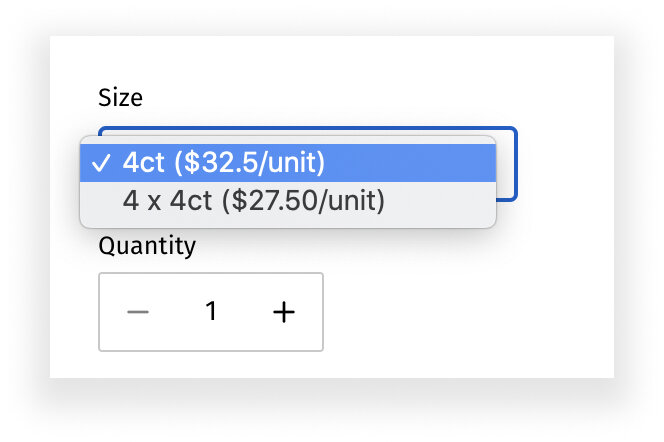
Pain point: Each product needs to be broken down into two variant options — smaller (SKUs start with a 4) and larger (SKUs start with a 5) sizing. The larger size has to be hidden from non PLUS+ members — per business standards.
In lemans terms, businesses want to ensure that the pricing for the largest quantities is hidden so that consumers don’t see the fab deals they get for buying in bulk.
First, we were able to design variant buttons to make options more visible.
Since the larger SKUs are the only ones that needed to be hidden, we coded in a lock on the 5000-level SKUs to hide them from anyone not logged into their PLUS+ accounts.
Product Discovery.

How can we always make sure discovery is possible?
You may also like… This was one of the easiest ways to make ensure each product page is recommending something else to view — encouraging browsing behavior amongst our users.
Adding this node really came from the competitive research from the start, I realized most successful companies were suggesting products at every touchpoint in the user flow.

Customer Service.
What is the best way to contact customer service?
After some research into best contact methods, we opted to add a quick chat feature to the website that would appear as a bubble in the bottom right-hand corner. This takes away from the stress of ordering because help is only a click away. To some limitations in customer service, the company didn’t have the bandwidth for a phone line contact.
The chat feature allows the customer team to receive direct pings to their phones with user questions.
Another great way to introduce new products with complete control are story nodes. I quickly mocked up a wireframe for our developer to create a simple card that allowed our team to change up the messaging based on product pushes.
This is a feature I’ve noticed in the bones of most e-commerce websites. I liked the idea of breaking up the homepage and allowing other teams like marketing to have a spot for

Subscriptions.

Additional Information.
How can I make re-ordering easier for the business?
After much research and many phone conversations, we decided to go with ReCharge as our primary application to run the subscription services. We spent a week wireframing the best flow for our business model to present to ReCharge. Our team quickly realized between budget and a tight timeline, building out the entire flow wasn’t a possibility.
Instead, we chose a common subscription flow and coded it into our site based on ReCharge recommendation.

Where does a user get more information? Each product page needed a way to present product information such as nutritional values, sizing, ingredients, and descriptions.
We designed tabs on each product page that were manually added to allow us to accurately add all the necessary information.
Education.

Navigation.

How can we educate them on the best ways to incorporate these foods into their menus and stores?
We learned that our brands already had a ton of resources on their websites, so instead of reinventing the wheel and creating our own — we created an experience around culinary guides on the website to help educate our PLUS+ members.
Pain point: Can I move around from the product to the main collection pages with ease?
Breadcrumbs! One of my favorite ways is to make sure navigation stays within the website and allows users to view their moves throughout the website at a glance.
Accessibility.
Where I could, I also tried to improve the accessibility as much as humanly possible in the time frame we had by making little improvements such as adding icons, improving text sizes and even just highlights to text fields so the user actually knew where they were in the page.
Our progress.

DURING

AFTER

Some of my favorite additions to the website included:
Tiles as CTA for culinary guides and case studies.
Product images changing upon hover state. Frozen image as hero —> prepared dish upon hover.
Clean and condensed navigation bar.
BEFORE
I say semi because we’re still actively solving for much of the website.
Once we switched to a B2B model fully - the average order increased by 20% since businesses were buying in bulk.
55% of users were returning with a 1.88% conversion rate (industry standard is 2% for established sites).
We saw a 45% increase in PLUS+ customers once we were primarily wholesale.
Bounce rates decreased by 12%.
Average user sessions increased by 20 seconds to 2:32.
Overall, the web re-launch was successful and received well by all of our returning customers (with an adjustment period, of course).
To semi-conclude.
Retrospective.
Testing and marketing.
Taking the feedback we had received from initial interviews and implementing it into the new site became our first priority, followed by the need for more feedback. We began to use our email mailing lists for PLUS+ customers to acquire folks willing to speak to us in more user interviews — as well as a survey that had a higher response rate and a larger quantity of feedback.
Team and timelines.
Working in tandem with my lead developer made decisions much easier since we were limited in scale due to Shopify. With that, I accounted for 2-week sprints that allowed me to test our previous site updates and design new ones — all the while my developer adding new features. Creating a cycle of innovation.
To Conclude.
Overall, the re-launch of the website gave us more control to design for the user.
With the update, we continue to iterate on issues that seem to be small issues but make a huge impact (I.E. accordion nutritional facts) and general user flows (I.E. subscriptions, the sign-in process).
Ideally, we can focus on more defined flows for both subscription and checkout flows — but because of limited resources and bandwidth, we have to be strategic in choosing which route to take.